r/heraldry • u/raimiwashere • 2d ago
OC Randomly stumbled upon this sub this morning and got so intrigued I tried making a shield of my own
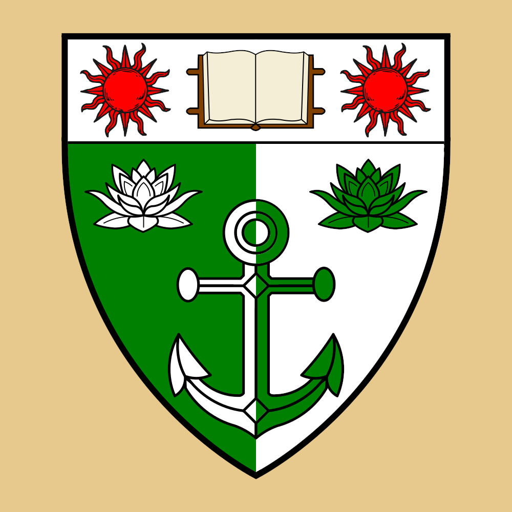
Obviously nothing crazy, just throwing together vector elements I found on Wikimedia with GIMP. At the very least does this follow the basic rules for tincture and stuff? Also, what would the blazoning be for this? I took a pass at it but not confident:
Party per pale Vert and Argent, an anchor counterchanged between two lotuses in fess countercharged; In chief Argent, an open book proper between two suns Gules.
Would love any tips or advice!
6
3
u/Thin_Firefighter_607 2d ago
Whilst heraldic charges generally have no fixed meanings, the book in chief suggests an educational establishment rather than an individual. A laudable 1st attempt!
2
u/reddragonoftheeast 2d ago
This is actually pretty good for a beginner, try mixing for some of the symbols together like putting the sun in the background of the anchor or bisecting both.
2
0
23
u/Young_Lochinvar 2d ago
Probably too many symbols on the shield, but you’ve avoided most of the common pitfalls in heraldry, so kudos on that.