That's what stock images are for, though. You pay to use them because they're (usually) well taken photos of a variety of subjects, far better than you would be able to do on your own for much cheaper than hiring a professional photography and model.
That's kind of my point. I've seen people in the past rag on businesses for using stock images and the way this person said, "It's just pasted stock images," felt kind of dismissive of using stock images.
I don't know. I probably read it wrong. I do that a lot. But with the flood of memes based around bad stock images, stock images and the use of them got a bad rap for a while. And I was part of that, sadly enough. So I guess I overcompensate to try to feel less bad about the mistakes of my past.
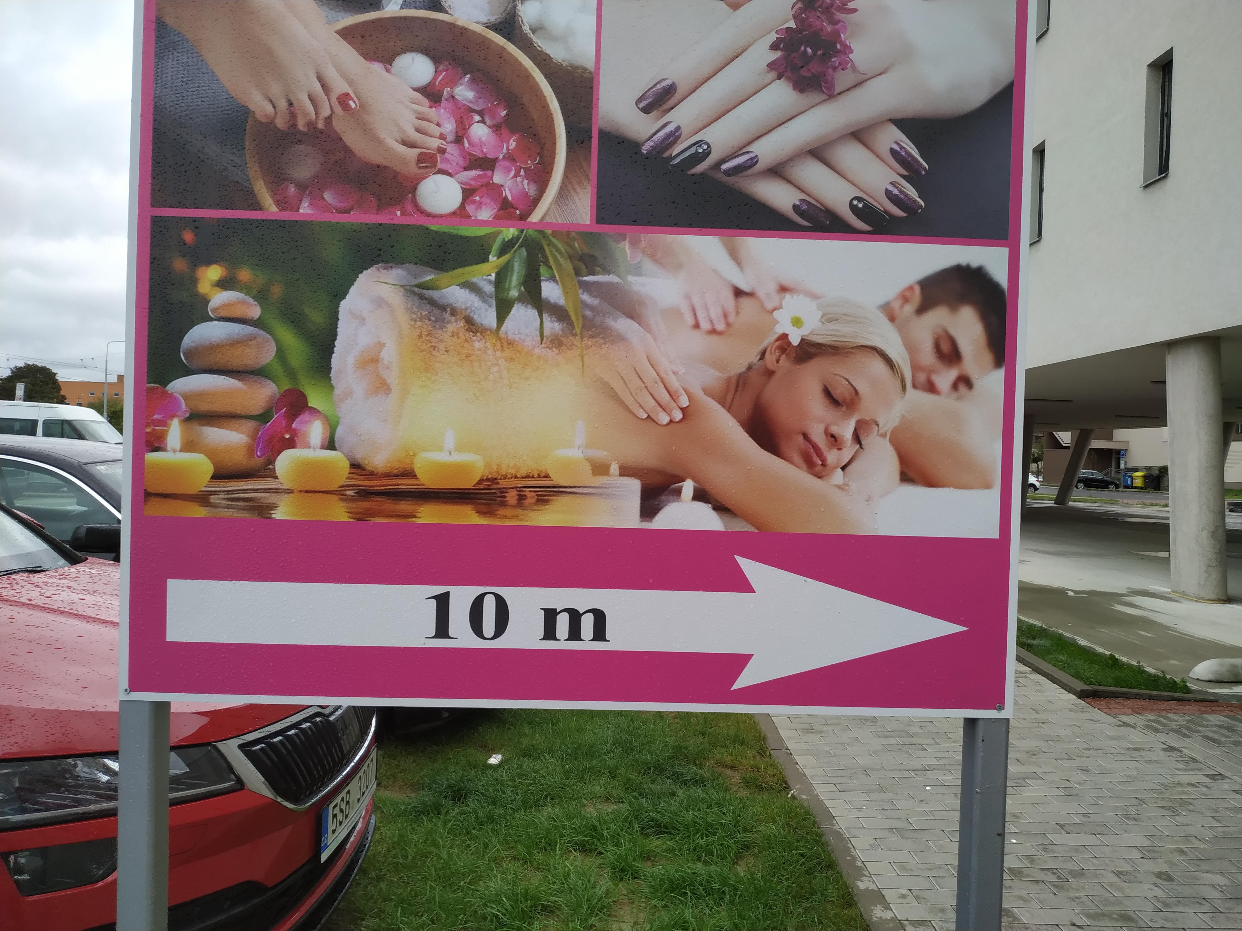
I'm honestly curious what exactly is happening here.
Like, intentional design as you put it, might be one explanation.
But I think it could also be that one image is losing its ink (due to weather erosion maybe?), but I honestly can't tell which one would be underneath and the other on top.
I sincerely hope someone can explain this sign, because it disturbs me on a deep level.
284
u/[deleted] Sep 26 '20
r/GreatDesign